Overall Goal
After deciding brand direction and core values, I set out to design a logo for the wizard company I was building that aligned with our vision for a high-tech retirement savings FinTech product designed to save you time. This product had goals of being innovative, edgy, and fun - so we made it happen!
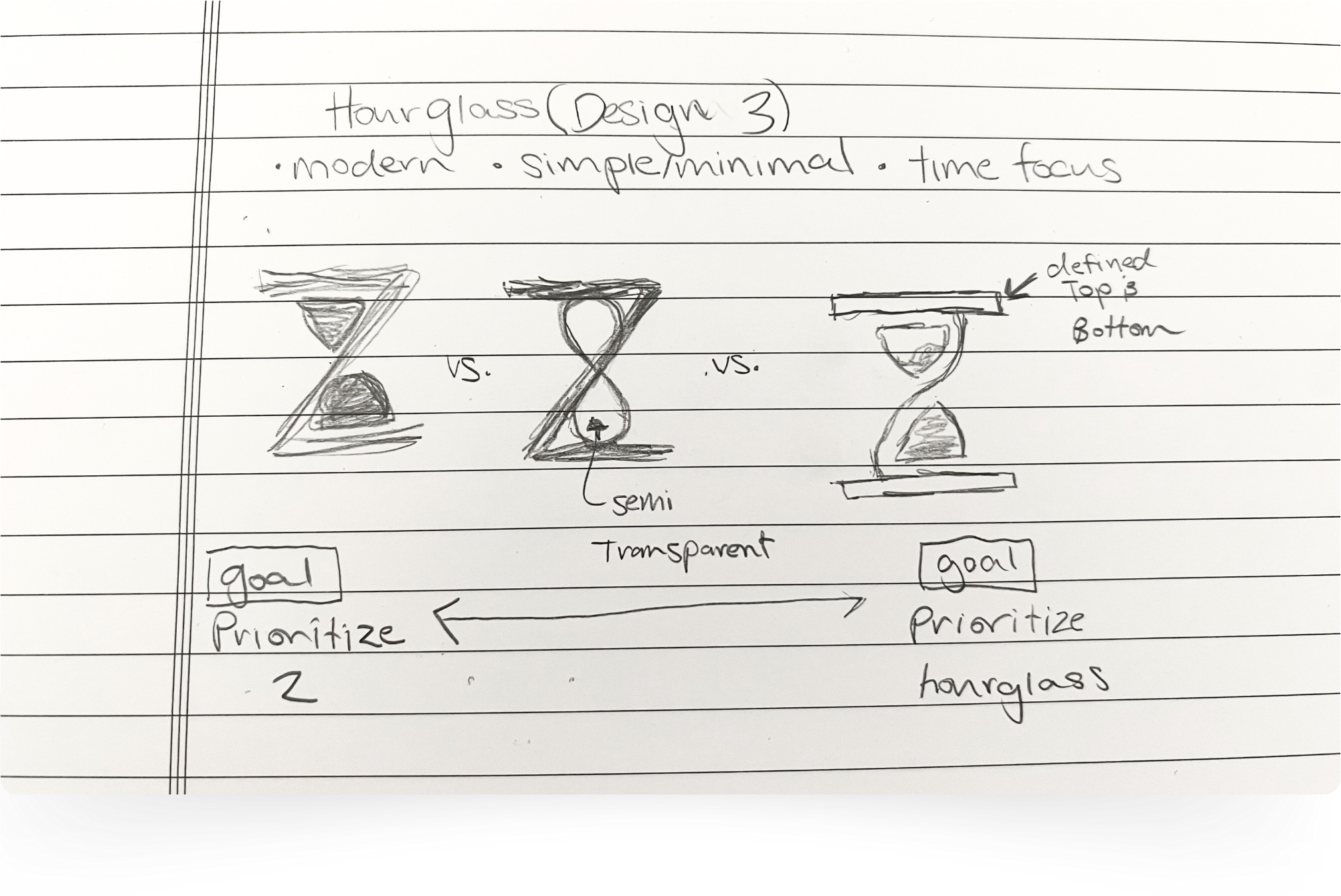
To start this process I spoke with several representatives from Carnivore Trading, our sponsor company, to get early input on ideas. After introducing the concepts, they selected concept number three, where the Z in Wizard would become an avant-garde hourglass. With this concept, the hourglass represents a focus on time, which in our case, is one of our main value propositions - giving you time back by reducing the time it takes to retire. Following this conversation, I drew the following three hourglass design ideas to get a feel for some options. Early in the process, I wanted to ensure everything was done on paper. The point of doing everything on paper for myself as a designer was to get valuable input and bring something to them but not dedicating so much time that I lost creativity and fell into the sunken cost fallacy.

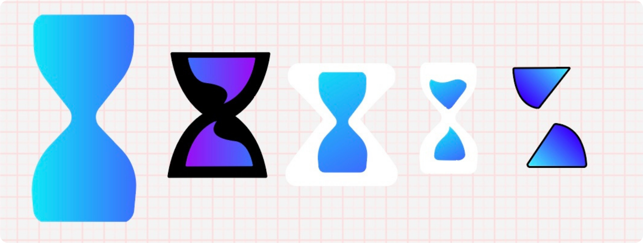
Then I got started in Adobe Illustrator. Note: to get the kind of specific manipulation I wanted on text and shape creation, I chose this platform over Adobe Photoshop. I pulled in the brand colors we decided on. Because we are entering the fintech landscape, we chose a trendy, innovative tech feeling sans-serif (Ubuntu) that we further rounded out. Additionally, to imply this cutting-edge tech feel, we employed a visually appealing gradient to look fresh, fun, and trendy. However, I realized find the perfect shape and design was HARD. I showcase 5 above but none of these "felt right." Very professional right? But seriously, it became a challenge to really intentionally use white space to create secondary meaning of an hourglass while creating balance and maintaining the integrity of the Z.
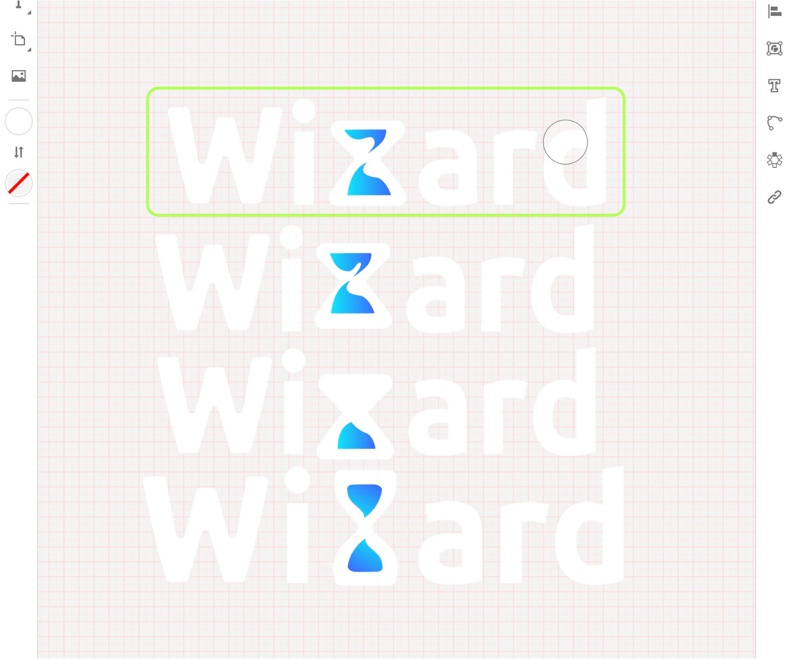
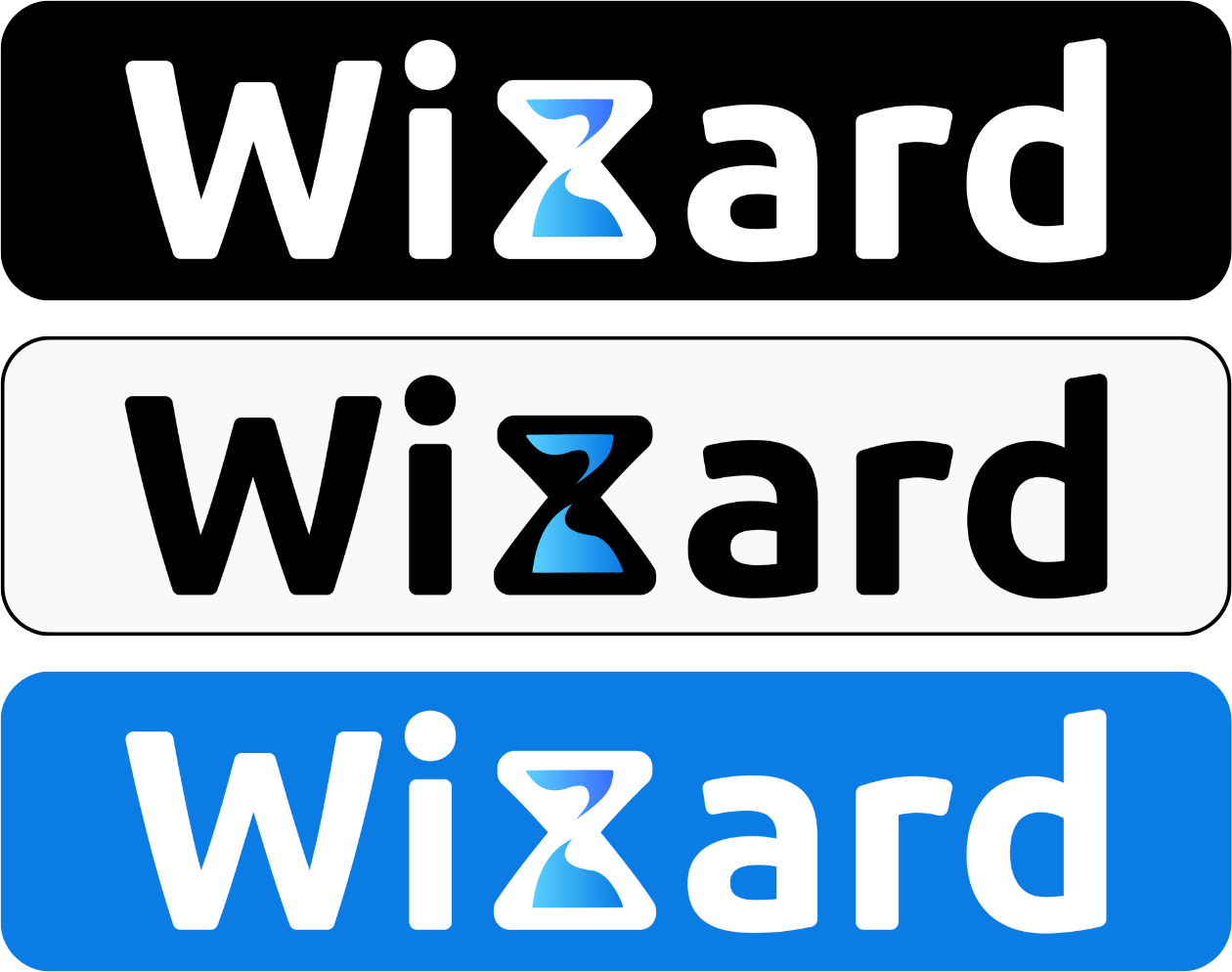
Eventually, I took the hourglass and went ahead and put it in the Combomark version. This context helped give me more design clues and step in and out of the close view and the zoomed view. It was at this point that I was able to select the top-most combo mark. Bringing this back to my client, they were very impressed and happy with the concept and the execution. From here I touched up this first logo and created versions for light backgrounds and dark backgrounds for all of these cases this logo could be used for. The results of this process are included below!
Thank you for reading. If you are curious about the Wizard project overall, you can continue by reading about the full process in the Wizard case study!
Wizard Pictorial Marks

Wizard Combomarks
